Nautical Color Palettes: How to Use Navy, White, and Natural Tones Like a Pro
Let’s be real: nothing says easy-breezy-chic like a nautical color palette. Navy, white, and natural tones are the coastal trio that look expensive without trying—like your home just casually wandered off a sailboat in the Mediterranean. The best part? You don’t need a beach house to pull it off. You just need a plan, a few smart choices, and maybe a sailor stripe or two (I won’t judge).
Ready to bring in that crisp, coastal vibe without going full “lighthouse museum”? Here’s how to nail it—stylishly, simply, and with zero seashell overload.
1. Start With A Crisp Base And A Confident Anchor
Think of your palette like a classic outfit: white is your tee, navy is your blazer, and natural tones are your tan leather sandals. Timeless, polished, and impossible to mess up. You’ll get a fresh, airy foundation with just enough contrast to feel intentional.
Choose Your White (Yes, It Matters)
- Bright white: Perfect for modern spaces with lots of light. Think gallery-clean walls and glossy trim.
- Soft white: Warm and forgiving—great for cozy rooms, rental apartments, or north-facing spaces.
- Off-white: Adds instant age and nuance. It plays well with rustic woods and woven textures.
Let Navy Do The Heavy Lifting
Use navy as your anchor. It’s bold but classic, dramatic but not shouty. Dose it intentionally so it feels deliberate, not dreary.
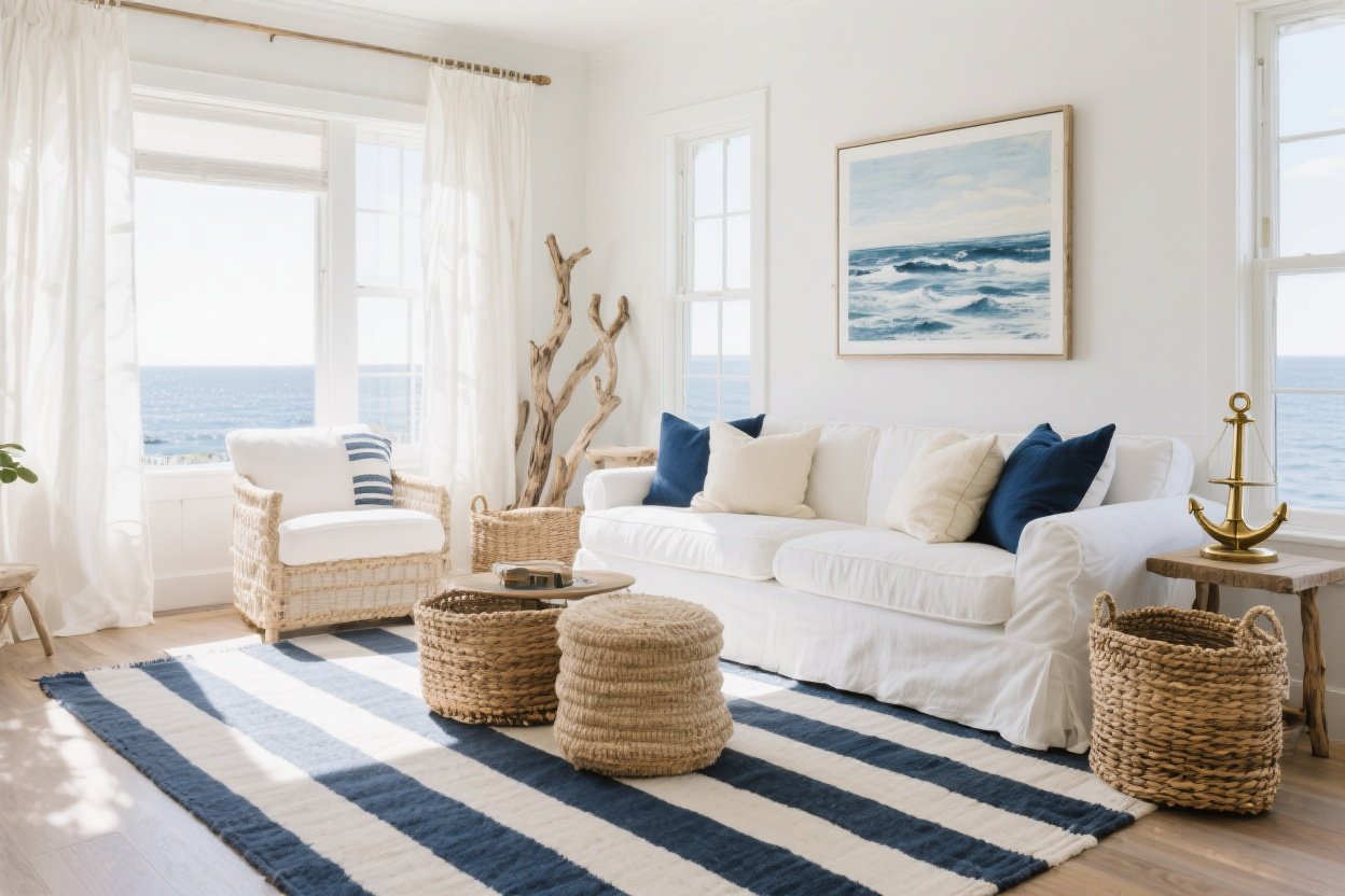
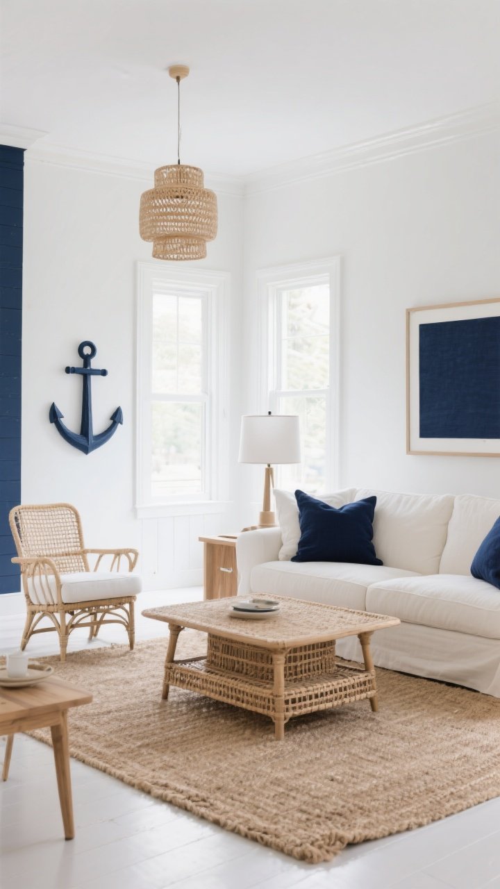
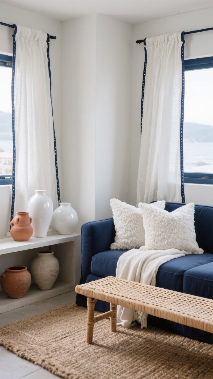
- Pick one big moment: A navy accent wall, sofa, or rug grounds the room.
- Balance with white: Pair navy elements with crisp white to keep things buoyant, not heavy.
- Repeat it: Sprinkle navy at least 3 times—think pillows, lampshade, and art frame—so it looks cohesive.
Natural Tones = Instant Warmth
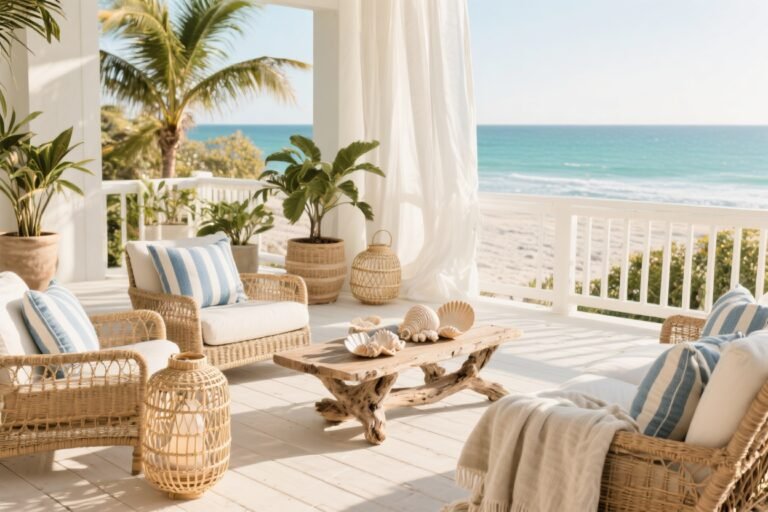
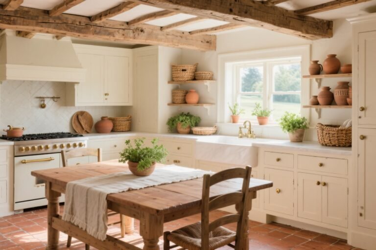
This is where the space stops feeling nautical theme-park and starts feeling chic. Bring in rattan, jute, linen, driftwood, cane, and light oak to soften the high contrast of navy and white.
- Rugs: Jute or sisal adds texture underfoot and hides life’s little messes.
- Lighting: Woven pendants or linen drum shades add glow and warmth.
- Furniture: A cane-back chair or raw-wood side table = chef’s kiss.
Pro move: Keep the ratio around 60% white, 25% natural tones, 15% navy. It’s flexible, but this balance keeps things airy and inviting.
2. Layer Textures Like A Designer (Because You Are)
Color is the headline, but texture is the story. If everything is too smooth, coastal can go clinical. If everything’s too rough, it can feel beach-shack. The magic? Mix both.
Mix These Textures For Coastal Depth
- Soft + structured: Pair a clean-lined navy sofa with nubby white bouclé pillows.
- Shiny + matte: Glossy white ceramics with matte terracotta or chalky pottery.
- Woven + tailored: A rattan bench next to crisp white drapery with navy tape trim.
Textiles Do The Heavy Lifting
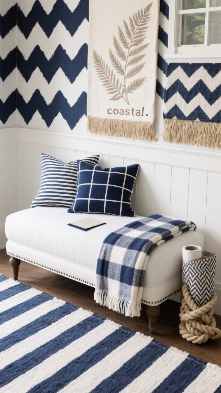
- Throws: Go for linen, chunky cotton, or a soft ticking stripe. Mix patterns, but keep them calm.
- Pillows: Combine stripes, solids, and small-scale prints in navy and white, then add one pillow in warm sand or camel.
- Window treatments: White linen panels with a navy border = luxe resort energy.
FYI: If your space is small, keep the biggest textures (jute rugs, heavy weaves) on the floor and go lighter up top so the room doesn’t feel bottom-heavy.
3. Choose Patterns That Whisper “Coastal,” Not “Costume”
We love a stripe. We do. But if your room starts to look like a yacht uniform, dial it back. The trick is to mix patterns with different scales and stick to the palette.
Pattern Pairings That Never Fail
- Stripes + Solids: A wide navy stripe on the rug, solid white sofa, and small striped pillows—balanced and crisp.
- Checks + Botanicals: Navy windowpane throw with a delicate fern print in soft taupe or sand.
- Geometrics + Nautical Nods: A subtle herringbone with a rope-knot motif—yes, it’s theme-y, but chic when sparing.
Where To Put The Patterns
- Floor: Anchor with a striped or geometric rug in navy/white.
- Walls: Try white shiplap, beadboard, or grasscloth wallpaper in a natural tone for texture without chaos.
- Accent Fabric: Roman shades in a tight stripe or a bench cushion with a piped edge—small details, big effect.
IMO: Avoid literal motifs everywhere (anchors, shells, boats). One witty nod is charming; twelve is a souvenir shop.
4. Elevate With Metals, Woods, And Lighting
Here’s where your nautical palette gets that elevated designer finish. Metals, woods, and lighting change the mood instantly—from beach-cottage cute to coastal-luxe grown-up.
Metals That Make It Modern
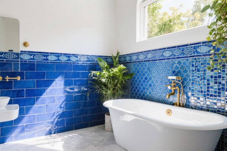
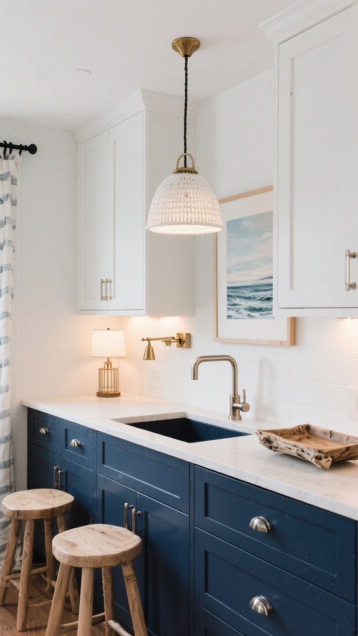
- Polished nickel: Sleek and maritime without shouting. Gorgeous with navy cabinetry or bathroom fixtures.
- Brushed brass: Adds warmth against white walls and rattan textures. Think sconces, mirror frames, or cabinet pulls.
- Matte black: Use sparingly for contrast—great on curtain rods or picture frames.
Wood Tones That Play Nice
- Light oak and ash: Keep things airy and Scandinavian-meets-coastal.
- Weathered finishes: Driftwood tones read naturally nautical without cliché.
- Avoid heavy cherry/mahogany unless you’re going for classic yacht club—then mix with lots of white to lighten it up.
Let There Be Glowy, Layered Light
- Ambient: Woven pendants or white drum fixtures set the tone.
- Task: Brass or nickel lamps on side tables—bonus if the shades are linen.
- Accent: Picture lights above coastal art or a discreet LED strip in a built-in.
Pro tip: Use warm bulbs (2700–3000K) to keep navy rich and whites creamy. Cool light can make everything look flat and chilly. No thanks.
5. Style It Smart: Art, Accessories, And Real-Life Rooms
Accessories are where your personality shines. Keep it edited, keep it intentional, and keep it coastal-adjacent—not a boat party. Here’s how to put the finishing touches on your navy, white, and natural tones moment.
Art That Feels Effortless
- Abstracts in navy and sand tones—modern, moody, and not too specific.
- Vintage nautical maps or coastal landscapes in light wood frames—instant character.
- Black-and-white photography with white mats and thin black or brass frames.
Accessories That Don’t Scream “Theme”
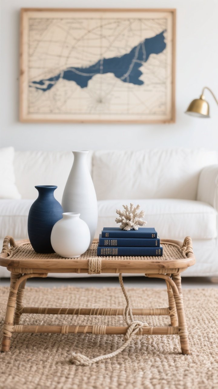
- Ceramics in matte white or deep navy—play with heights and shapes.
- Natural bowls and trays in rattan or unfinished wood to corral remotes and candles.
- Books: Stack a few in navy spines; tuck a tiny coral fragment or knot rope on top—one, not five.
Room-By-Room Ideas
Living Room: Start with a white or oatmeal sofa, navy rug, and rattan coffee table. Add striped pillows and a brass floor lamp. A jute basket by the sofa keeps throws handy and hides extra clutter. Done.
Bedroom: White walls, navy upholstered headboard, and linen bedding with a navy border. Swap in woven nightstands and polished nickel lamps. Hang a vintage map above the bed and call it a day (or a weekend on Nantucket).
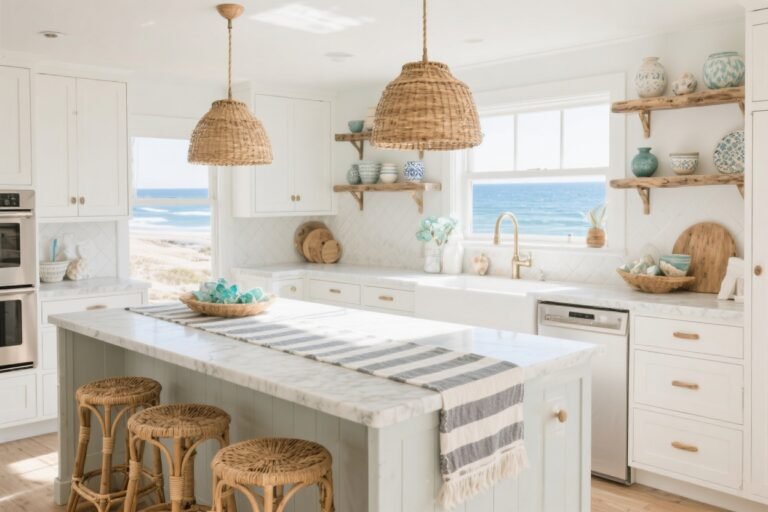
Kitchen: Navy lower cabinets, white uppers, and brushed brass hardware—classic for a reason. Add rattan counter stools and a runner with a small-scale stripe. Bring in cutting boards in light wood for warmth.
Bathroom: White subway tile, navy vanity, polished nickel fixtures. Layer in a striped Turkish towel, woven hamper, and a small coastal print.
Entryway: White walls, slim black hooks, woven bench cushion, and a navy runner. A round brass mirror keeps it elevated; a jute rug keeps it real.
Common Mistakes To Dodge
- Too much navy: If the room feels heavy, add more white textiles and lighter woods.
- Monotone whites: Mix textures—linen, ceramic, plaster—so white doesn’t feel flat.
- Over-accessorizing: Edit. Then edit again. Negative space is your friend.
FYI: If you feel “overly nautical,” swap one literal item (anchor art) for something abstract, and introduce an extra natural-texture piece (like a cane tray). Instant reset.
Quick Shopping Checklist
- Anchor piece: Navy rug, sofa, or dresser.
- White foundation: Walls, bedding, curtains, or slipcovers.
- Natural textures: Jute rug, rattan lamp, cane chair, linen pillows.
- Metal accents: Brass or polished nickel hardware and lighting.
- Layered textiles: Striped throws, piped pillows, textured ottomans.
- Subtle art: Abstracts, maps, or coastal photography.
Bonus color pop? Add a whisper of soft sea glass green, muted clay, or pale sky blue in a vase or pillow. Keep it minimal so the core palette stays boss.
There you have it: a foolproof, endlessly stylish way to bring nautical color palettes into any space—cozy apartment, city townhouse, or actual beach house (lucky you). Keep the base crisp, the textures layered, and the accessories intentional. Your home will feel fresh, calm, and just a little bit like a vacation—minus the sunscreen smell.
Now go chase that breezy, collected vibe—and remember: one anchor is cute; a fleet is overkill.