8 Statement Tile Kitchens That Feel Like Art You’ll Want to Cook In
You know that feeling when you walk into a kitchen and immediately think, “Okay, this is a moment”? That’s the power of statement tile. It’s functional, it’s bold, and when done right, it turns your everyday cooking zone into a gallery you also sauté in.
Ready to go from basic backsplash to full-on masterpiece? Here are eight artful tile ideas that bring the drama—without making your space feel like a museum (no hushed voices required).
1. Color-Drenched Checkerboard, But Make It Modern
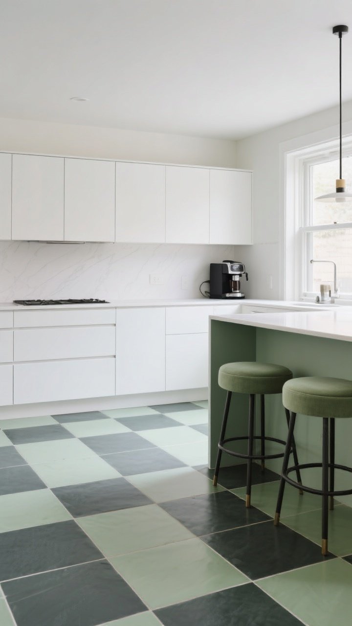
Checkerboard tiles aren’t just for retro diners. Swap black and white for a surprising duo—think sage and charcoal or terracotta and blush—and suddenly the grid feels contemporary and chic.
Keep the pattern large-scale for a cleaner look. Smaller checkers can read “busy,” while bigger squares feel more designer-y and calm—like a well-planned outfit that just happens to match your espresso machine.
Pro Tips
- Scale smart: 6×6 or 8×8 tiles keep the vibe modern and avoid visual noise.
- Balance the palette: Repeat one checker color in your bar stools or rug.
- Let it land: Run the checkerboard from floor up the toe kick for a custom look.
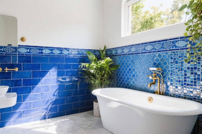
2. Hand-Painted Zellige That Shimmers Like Jewelry
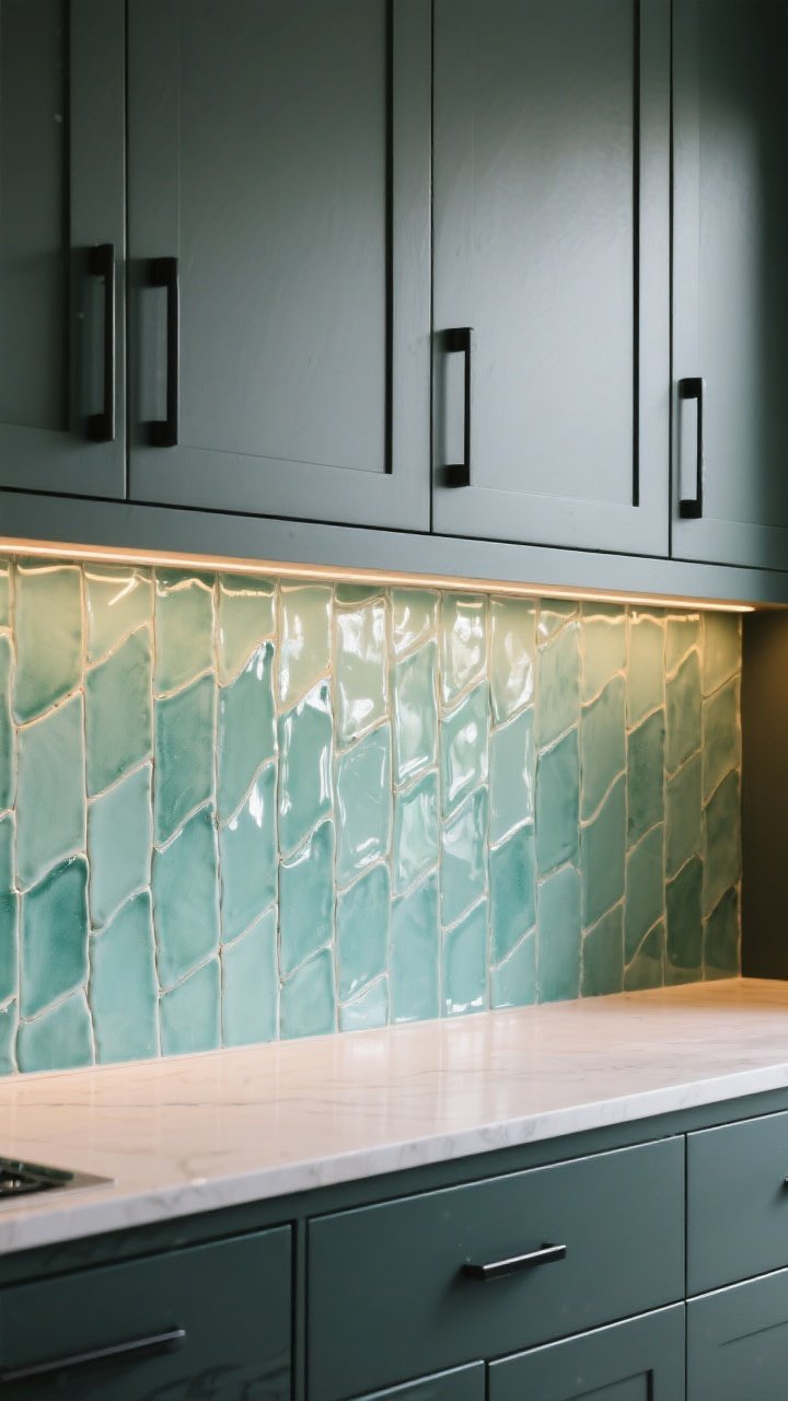
Want that soft, soulful glow? Zellige tiles are the instant upgrade. Their hand-cut edges and glazed surfaces bounce light in a way machine-made tiles simply can’t. Translation: your kitchen gets that “I wake up in a boutique hotel” energy.
Stick with a single hue to let the texture shine. The tonal variation and irregular edges add movement that feels like brushstrokes—quietly artistic, zero effort.
Pro Tips
- Mix finishes: Matte hardware + glossy zellige = chef’s kiss contrast.
- Grout matters: Use a color that blends to keep the look serene.
- Go vertical: Stack tiles soldier-style for a fresh, architectural line.
3. Graphic Terrazzo That Acts Like Wall Art
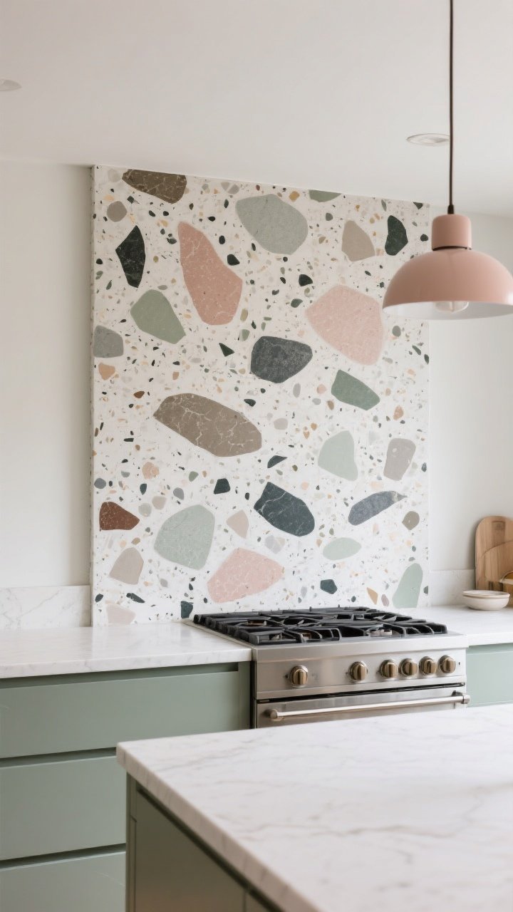
Terrazzo isn’t just a floor diva. A terrazzo slab backsplash reads like an abstract painting, with flecks of color that tie your whole scheme together. It’s bold, but surprisingly forgiving because the pattern is so varied.
Keep your counters simple and let the terrazzo sing. It’s like the lead singer; everyone else is backup vocals.
Pro Tips
- Spot your accent: Pull one chip color into your textiles or pendants.
- Minimal seams: Use larger slabs or oversized tiles for a gallery effect.
- Sheen check: Honed finishes keep the look luxe and not too shiny.
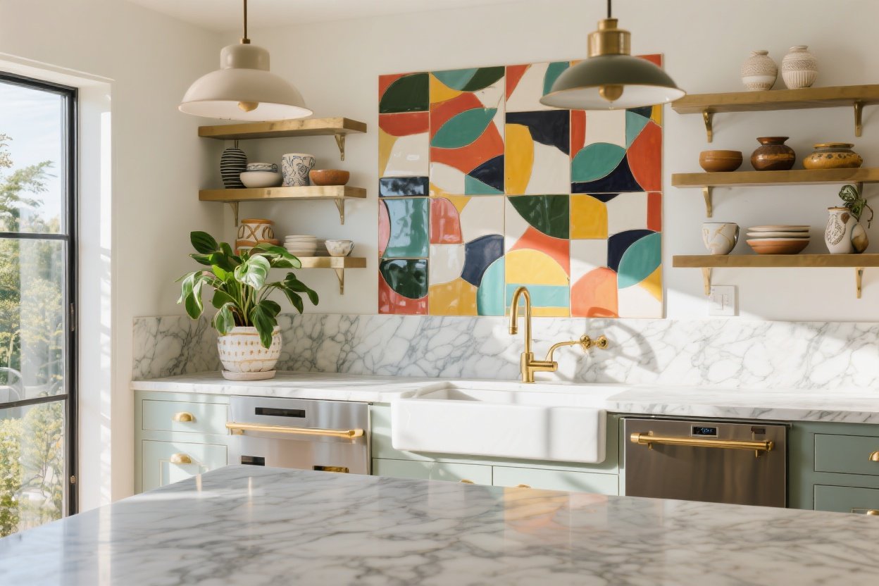
4. Moody Mosaics With A Glow-Up
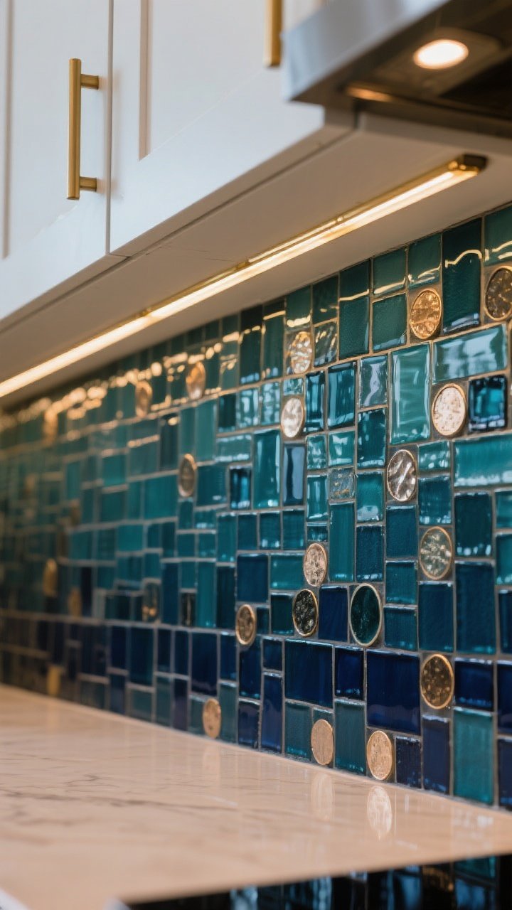
Mosaic tiles don’t have to feel like a spa. Go moody and dimensional—deep teal, oxblood, even inky navy—and layer in warm lighting. The space instantly feels intimate, like your kitchen put on eyeliner and a leather jacket.
Use mosaic sheets to create gradients or borders. It’s a subtle way to get an artful edge without shouting “I tiled a mural.” IMO, it’s quietly iconic.
Pro Tips
- Light it right: LED strips under cabinets make mosaics sparkle.
- Keep lines clean: Finish edges with schluter trim in brass or black.
- Mix shapes: Pair penny rounds with slim rectangles for depth.
5. Oversized Pattern That Wraps The Room
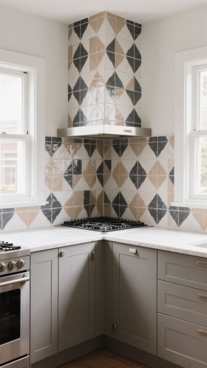
Go big or go home? Try large-format patterned tiles that wrap from the backsplash onto an adjacent wall or the range hood. It’s immersive, like stepping into a mural—minus the paint fumes.
To keep it from overwhelming, limit your color palette to two or three tones and let the scale do the talking. It’s dramatic, but still digestible. Like a runway moment you can actually cook next to.
Pro Tips
- Anchor with solids: Matte counters and simple cabinetry keep focus on the pattern.
- Align the repeat: Dry-lay tiles to map out symmetry around focal points.
- Consider the hood: Tiling the hood creates a true statement silhouette.
6. Watercolor Ombre That Feels Airy And Custom
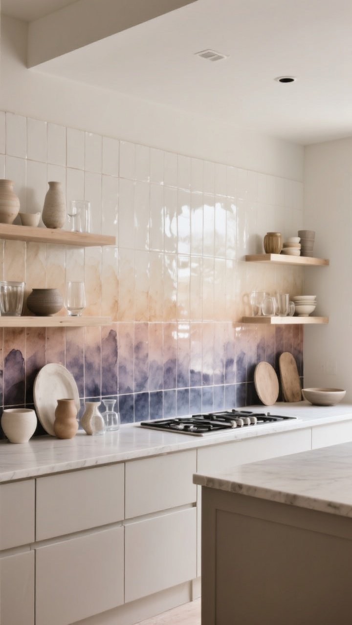
If you’re allergic to harsh lines, try a soft ombre gradient. Start with deep tones near the counter and fade to pale near the ceiling, or vice versa. It’s soothing and artsy—perfect if you prefer subtle drama over fireworks.
You can DIY the effect using different shades of the same tile collection. Or mix glossier pieces near task zones to bounce more light—FYI, it’s practical and pretty.
Pro Tips
- Plan your fade: Sketch the gradient so the transition looks intentional.
- Keep grout calm: A neutral grout lets the color do the work.
- Echo the gradient: Style shelves with items that mirror the ombre tones.
7. Geometric Inlays That Frame Your Focal Points
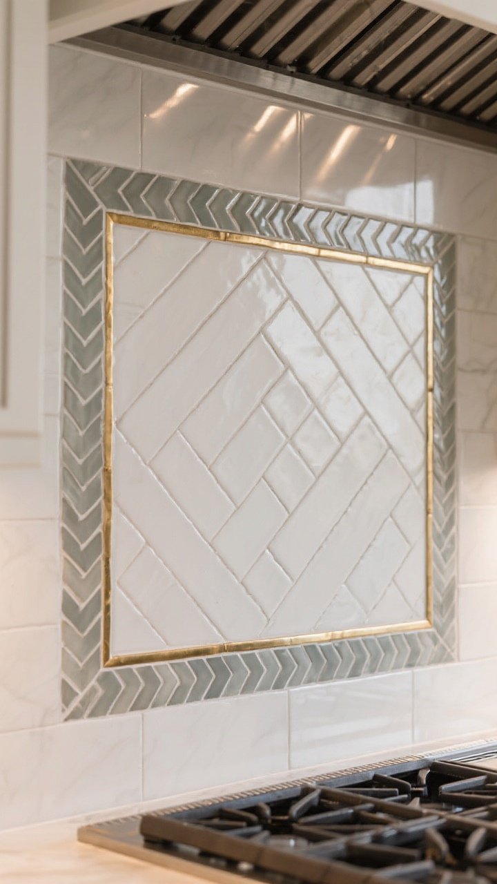
Think of tile like a picture frame. Use geometric inlays to border your range, sink, or open shelving. A framing band in a contrasting pattern creates instant architecture without knocking down a single wall.
It also solves transitional zones like the end of a backsplash—no awkward cutoff, just a crisp visual “full stop.” Your walls will look intentional and editorial.
Pro Tips
- Choose a motif: Herringbone field tile with a chevron frame = subtle layers.
- Mind proportions: A 2–3 inch border usually reads balanced, not busy.
- Play with metal: Brass trim between fields adds a gallery finish.
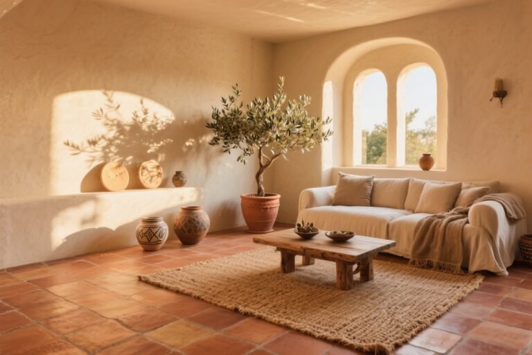
8. Earthy Clay And Terracotta With Artisan Energy
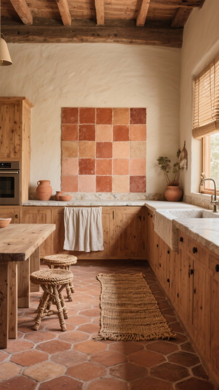
Craving warmth? Terracotta and clay tiles deliver that sun-baked, handmade feel that makes a kitchen feel lived-in (in the best way). They pair beautifully with natural woods, stone counters, and vintage rugs.
Vary the tones slightly for that collected look. Think desert shades: rust, sand, clay, and a whisper of peach. It’s cozy without going cottagecore overload.
Pro Tips
- Seal well: Natural clay needs a quality sealer to resist stains and splashes.
- Mix shapes: Square backsplash + hex floor keeps it interesting.
- Add texture: Linen shades and woven stools echo the organic vibe.
How To Choose The Right Statement Tile (Without Spiraling)
- Start with your palette: Pick two neutrals and one accent. Let your tile be the accent or the texture—rarely both.
- Test samples at home: Light changes everything. Check morning, afternoon, and evening.
- Scale to your space: Small kitchens love linear patterns and vertical stacks. Big kitchens can handle large prints.
- Consider upkeep: Glossy backsplash tiles wipe clean. Matte floors hide scuffs. Grout color can be your friend—go mid-tone to avoid constant scrubbing.
- Plan the edges: Finishing trim, bullnose, or a metal profile makes it look custom, not “weekend project.”
Installation Nuggets You’ll Thank Me For
- Dry-lay first: Map the whole layout on the floor to avoid awkward cuts around outlets and range hoods.
- Center the pattern: Align focal points—cooktop, window, hood—as your starting centerline.
- Level, level, level: Walls are rarely straight. Use ledger boards for perfectly straight first rows.
- Match outlets: Paint outlet covers to blend or upgrade to sleek screwless plates.
- Don’t skimp on grout: Higher-quality grout resists staining and cracking. Your future self will send a thank-you note.
Styling That Complements, Not Competes
- Repeat materials: Mirror tile tones in small doses—cookware, canisters, even art frames.
- Edit the counter: Bold tile + clutter = chaos. Keep surfaces curated and simple.
- Layer soft textures: Linen runners, woven baskets, or a plush rug keep strong tile from feeling cold.
- Mind your metals: Two finishes max. For example, polished nickel + oil-rubbed bronze, or brass + black.
Quick Shopping Checklist
- Order 10% extra: For cuts, breakage, and future repairs.
- Check caliber and shade: Ensure boxes match for consistent sizing and color.
- Choose the right trowel: Tile size determines notch size—ask your tile supplier.
- Seal natural stone and clay: Before and after grouting to avoid haze and staining.
Bottom line: statement tile is the easiest way to turn your kitchen into a space that feels curated, artistic, and totally you. Whether you’re swooning over zellige shimmer or going all-in on a graphic wrap, pick one bold moment and let it shine. Then light a candle, pour a sparkling something, and admire your new favorite room—gallery vibes, pizza nights, and all.