6 Colorful Tile Staircases You’ll Want to Copy Immediately
Your stair risers are basically a catwalk for your home—so why are they still wearing beige? Colorful tile staircases add instant personality, look custom, and honestly make you feel like you live in a boutique hotel. If you’ve been flirting with the idea, consider this your sign to go all in. Below are six bold, do-able ideas that take your stairs from “fine” to “whoa.”
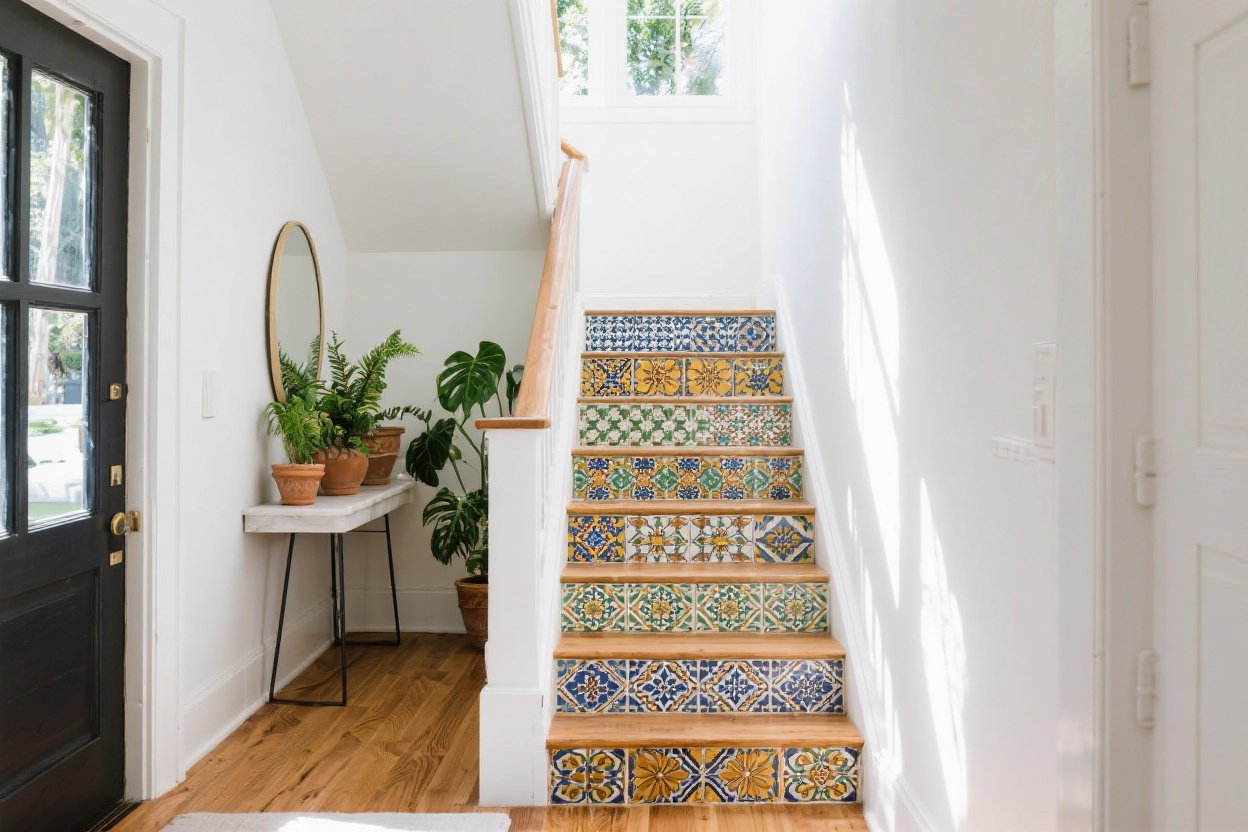
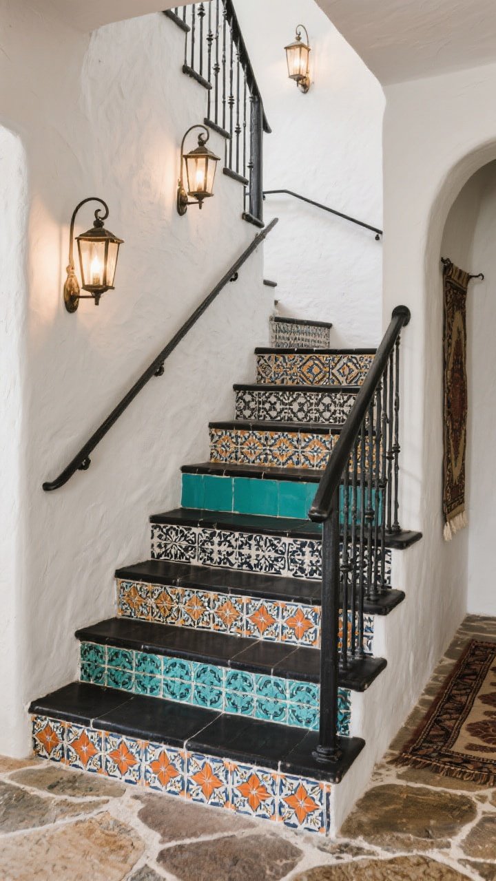
1. Mediterranean Mosaic Magic
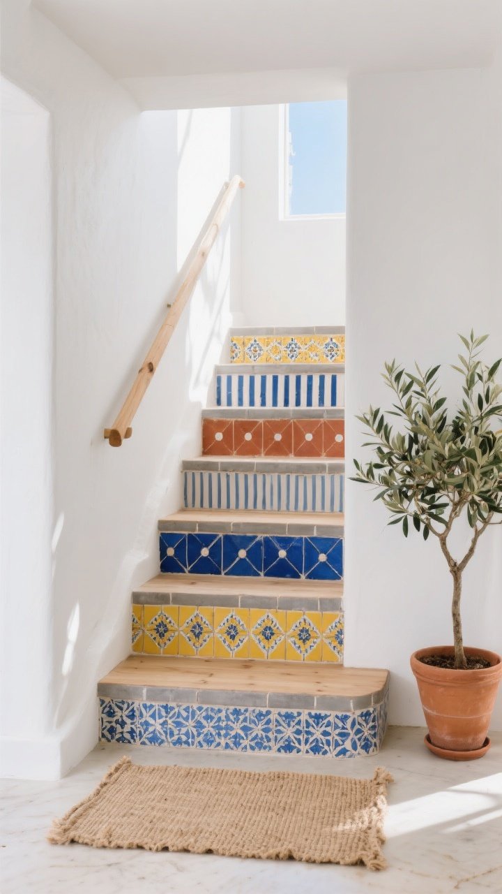
Think Santorini, but make it your foyer. A mix of cobalt, terracotta, and sunny yellow tiles turns plain steps into a breezy Mediterranean moment. The trick: keep the tread neutral and let the risers do the flirting.
Why It Works
- High-contrast blues pop against white walls or natural wood.
- Repeating motifs tie the stairway to nearby spaces—hello, cohesive vibe.
- It feels vacation-ish year-round. No passport needed.
How To Pull It Off
- Pattern mixing rule: Choose one hero tile pattern, then support with two quieter ones (stripes or dots).
- Use matte finishes to avoid glare and slippery drama.
- Grout color matters: warm gray softens the palette; crisp white sharpens it.
Styling tip: Add a jute runner nearby and a leafy olive tree in a terracotta pot. Instant coastal grandma chic, minus the mothballs.
2. Rainbow Risers, Grown-Up Edition
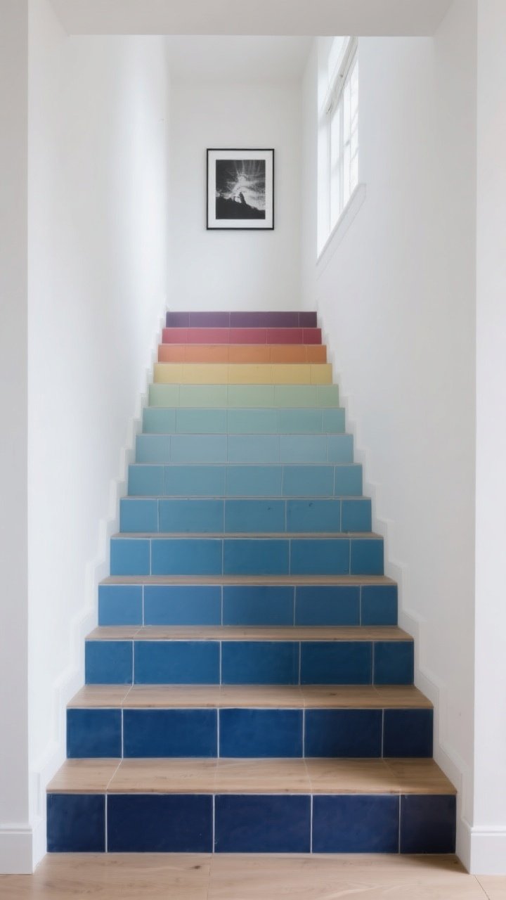
Yes, a rainbow staircase can look sophisticated—not like a preschool art project. The secret is tone-on-tone tiles that move from deep to light, step by step. Think wine-to-rose, forest-to-mint, or navy-to-sky.
Why It Works
- Ombré gradients guide the eye upward, making the stairwell feel taller and airier.
- It’s colorful without chaos—each step is its own mini moment.
- Pairs beautifully with minimalist decor, so your stairs do the talking.
How To Pull It Off
- Pick a single hue family (blues, greens, or warm reds) and source 4–6 shades of the same tile style.
- Line up tiles on the floor first to test your gradient before adhesive hits anything. FYI: sunlight changes colors, so check morning and afternoon.
- Finish with color-matched grout for a sleek, seamless feel.
Styling tip: Keep walls clean and art simple—one large black-and-white photo is perfect. Let the rainbow take the lead.
3. Spanish Revival With Modern Edge
Channel a historic Spanish home with Talavera-style tiles, but give it a 2025 update. Mix classic motifs (florals, stars, and arabesques) in a tight palette: black, white, and one spicy color like paprika or teal.
Why It Works
- Old-world pattern + restrained palette = timeless, not theme park.
- Geometric repeats read modern when paired with sleek railings.
- It plays nicely with plaster walls, natural stone, and wrought iron.
How To Pull It Off
- Alternate busy and simple tiles every other riser to create rhythm.
- Use charcoal grout to reduce cleaning stress and frame the patterns.
- Upgrade your handrail to black metal for a crisp contrast—instant editorial vibes.
Styling tip: Add metal lantern sconces and a vintage runner on the landing. It’s giving heirloom, but make it Instagram.
4. Graphic Monochrome With a Pop
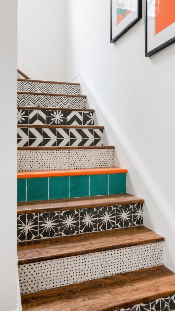
Not ready for eight colors? Try black-and-white patterned tiles with one surprise tone—like a single row of citrus orange or emerald mid-flight. It’s like eyeliner with a bright lip. Simple, striking, and seriously chic.
Why It Works
- High contrast adds drama without competing with the rest of your decor.
- One pop color keeps it playful, not chaotic.
- Photographs beautifully—your feed will thank you.
How To Pull It Off
- Choose two black-and-white patterns: one bold (chevron, starburst), one subtle (micro-dot, herringbone).
- Insert a single color band on the third or fourth step to break the sequence and draw the eye.
- Finish the treads with oiled wood for warmth. Stark white treads can feel too cold here.
Styling tip: Add two framed prints along the stair wall in your pop color. It ties everything together without yelling.
5. Coastal Zellige Meets Cottagecore
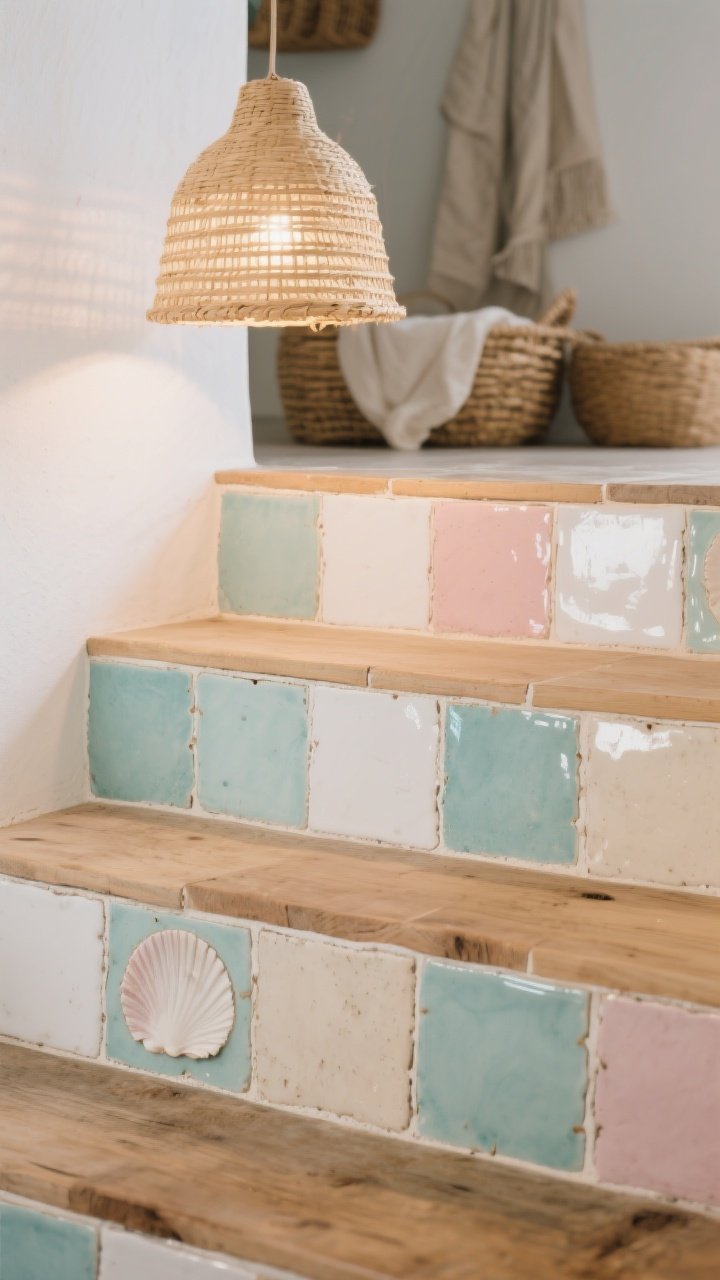
If you like your homes breezy and romantic, this one’s your soulmate. Use handmade-look zellige tiles in watery hues—seafoam, foam white, shell pink, and sandy beige—across the risers for that perfectly imperfect shimmer.
Why It Works
- Zellige’s subtle color variation gives movement in low light, aka stairwell magic.
- Soft coastal colors play nicely with woven baskets, linen, and white oak.
- It feels artisanal without looking try-hard.
How To Pull It Off
- Stick to two or three soft shades and distribute them randomly for an organic look.
- Use creamy grout (not stark white) so it blends with the gentle palette.
- Seal everything properly—zellige can be porous. Your future self will thank you.
Styling tip: A rattan pendant at the top of the stairs throws warm light and highlights the tile texture. Cozy, not coastal cliché.
6. Global Patchwork, Maximalist Heart
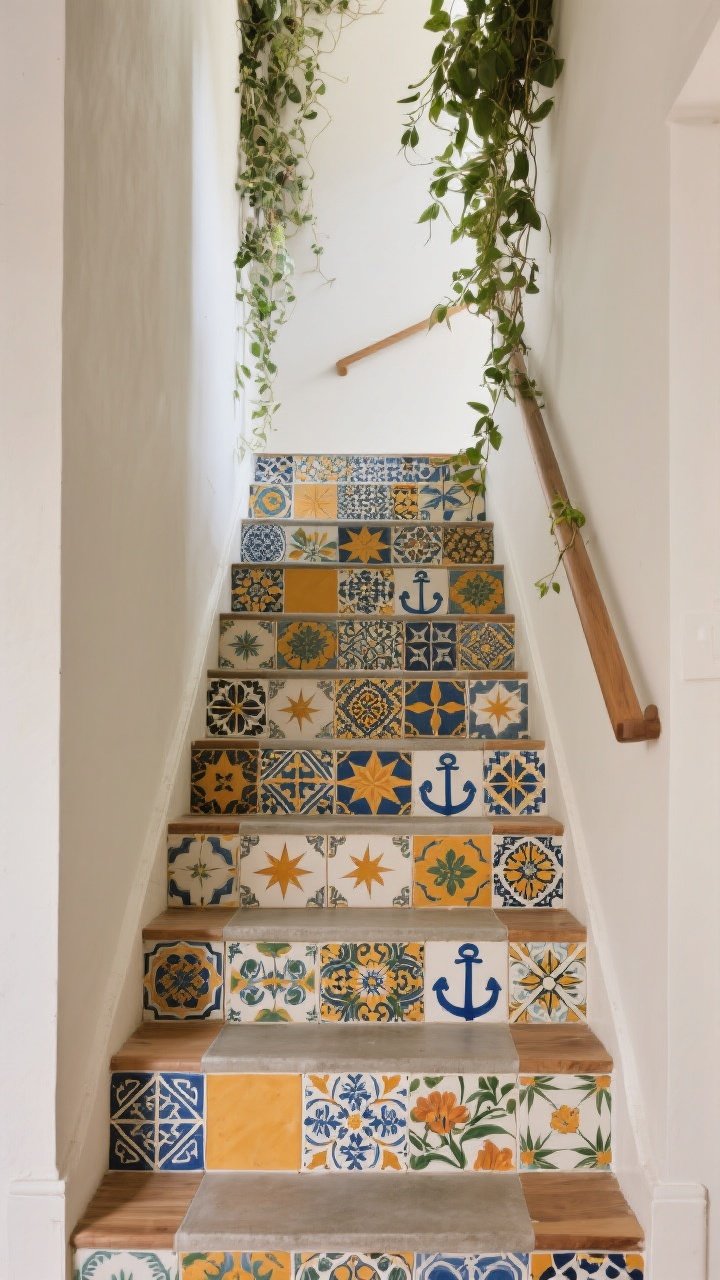
Ready to go full dopamine decor? A patchwork of global-inspired tiles—Moroccan, Portuguese, Mexican, even hand-painted florals—turns your staircase into a color-drenched story. Each step feels like a stamp in your passport.
Why It Works
- Mixed scale keeps the eye dancing: small stars, medium florals, big geometrics.
- Repeating one color (say, cobalt or marigold) anchors the wildness.
- It’s a conversation starter that actually earns the “wow” you’re chasing.
How To Pull It Off
- Lay out tiles on the floor like a quilt. Edit down to 3–4 primary patterns, plus accents.
- Balance busy risers with calm treads (natural wood or polished concrete).
- Choose mid-tone grout to blend edges; stark grout lines can make it feel choppy.
Styling tip: Keep wall paint neutral, then add a lush plant cascade from the landing. The green ties all the colors together effortlessly, IMO.
Installation Tips You’ll Actually Use
- Measure risers individually. Old homes = inconsistent heights. Cut tiles per step for clean lines.
- Use slip-resistant finishes on treads and confirm tiles are rated for vertical surfaces.
- Dry-fit first. Lay out your full design before adhesive. Take a quick photo for reference.
- Mind the nosing. Keep tile slightly shy of the tread edge to avoid chipping and toe-stubs.
- Seal, then seal again. Especially with cement or zellige. Grout haze can dull your shine.
- Lighting matters. Add LED step lights or a pendant—tiles deserve a spotlight (literally).
Budget + Sourcing Hacks
- Use decorative tiles only on risers. Buy affordable, durable treads. Big impact, lower spend.
- Sample smart. Order 6–10 samples and resell or repurpose extras as coasters or trivets—cute and eco-friendly.
- Mix real and lookalike. Splurge on a few artisan tiles, then fill with high-quality prints for balance.
- Outlet stores and tile yards often have remnant boxes perfect for patchwork designs.
Maintenance Made Easy
- Choose the right grout. Epoxy or stain-resistant grout keeps white patterns looking crisp.
- Weekly wipe-down. Microfiber cloth + gentle cleaner. Avoid acids on cement tiles.
- Annual reseal for porous tiles. Set a calendar reminder—future you will be smug.
Bottom line: your staircase can do more than just connect floors—it can set the mood for your whole home. Pick a style that makes you smile every time you climb it, then commit with good materials and a little patience. You’ll be shocked how much character those few vertical inches add—like, guests-stop-talking mid-sentence shocked. Now go make your stairs the star of the house.