7 Nautical Color Palettes Using Navy, White & Natural Tones You’ll Love
Ready to give your home that breezy, coastal vibe without going full pirate ship? Same. Navy, white, and natural tones are the holy trinity of nautical style—classic, crisp, and ridiculously versatile. The trick is pairing them in ways that feel fresh, not theme-party. Let’s dive into seven palettes that nail the look—no seashell chandeliers required.
1. High-Contrast Harbor Chic
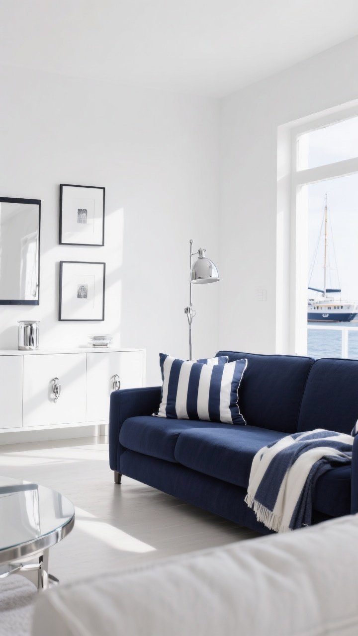
Think bold, clean, and timeless. This palette leans into crisp **white**, deep **navy**, and hits of **polished chrome** for that yacht-club glow. It’s the “freshly ironed linen shirt” of interiors—effortless and sharp.
Why It Works
The stark contrast between white and navy feels luxe and architectural. Add reflective metals, and suddenly the whole room looks brighter and more intentional.
- Walls: Bright white (with a neutral undertone so it doesn’t go blue)
- Furniture: Navy sofa or armchairs with clean lines
- Accents: Chrome or polished nickel lamps, frames, and hardware
- Pattern: Thin navy-and-white stripes on throws or pillows
Pro tip: Choose one hero navy piece—like a sofa or sideboard—and keep everything else light and airy. FYI, high-contrast rooms photograph like a dream.
2. Sun-Kissed Sailor Neutrals
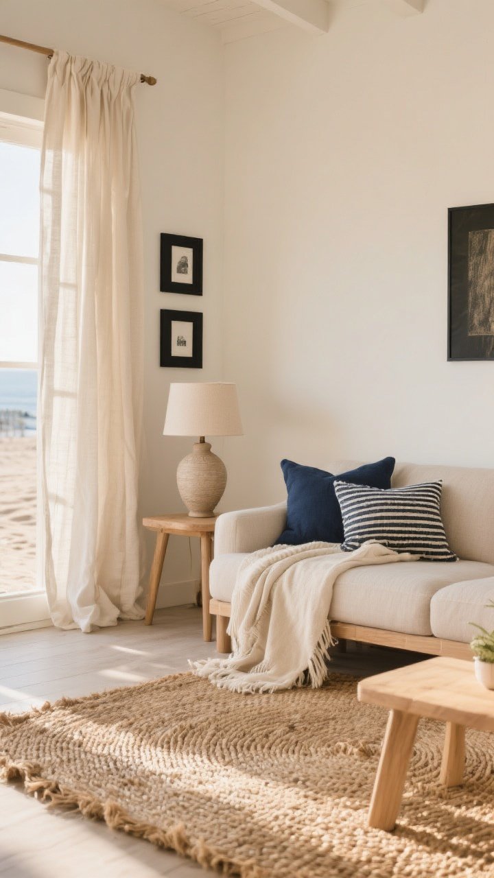
Want soft coastal without leaning nautical too hard? Go mostly **natural tones**—think sand, oat, jute—with gentle **navy** accents and **warm white** walls. It’s relaxed, beach-house, toes-in-the-sand energy.
Why It Works
Navy keeps it grounded, while warm neutrals create that sunlit glow. The vibe is “weekend forever.”
- Walls: Creamy white with a hint of warmth
- Textiles: Linen curtains, natural cotton throws, woven jute rug
- Accents: Navy pillows, ceramic lamps, matte black picture frames
- Wood Tones: Light oak or ash to keep it breezy
Pro tip: Mix textures like crazy—linen, jute, seagrass. When the palette is quiet, texture does the heavy lifting.
3. Moody Captain’s Quarters
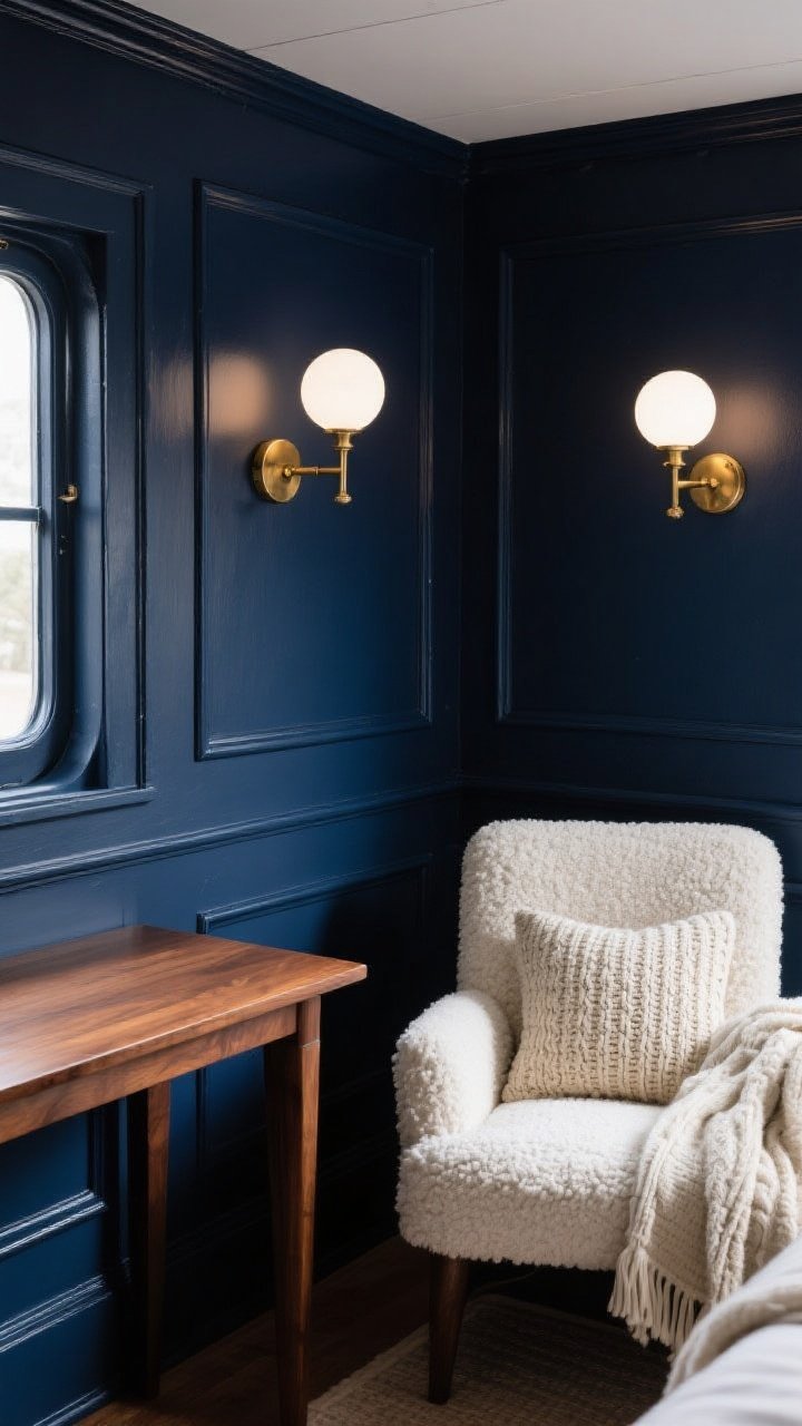
If cozy and cocoon-y is your love language, lean into a deep, moody **navy** with earthy **natural wood** and creamy **white** accents. It’s atmospheric without feeling heavy.
Why It Works
Dark walls add drama, while warm woods keep you from sailing into cave territory. White breaks up the depth so the room still breathes.
- Walls: Saturated navy (matte finish for major sophistication)
- Furniture: Rich walnut or teak with simple silhouettes
- Textiles: Off-white bouclé chair, wool throws, chunky knit pillow
- Lighting: Warm white bulbs, brass sconces for glow
Pro tip: Paint the trim the same navy as the walls. It’s designer-y and makes the room feel tailored—and yes, it also hides scuffs like a champ.
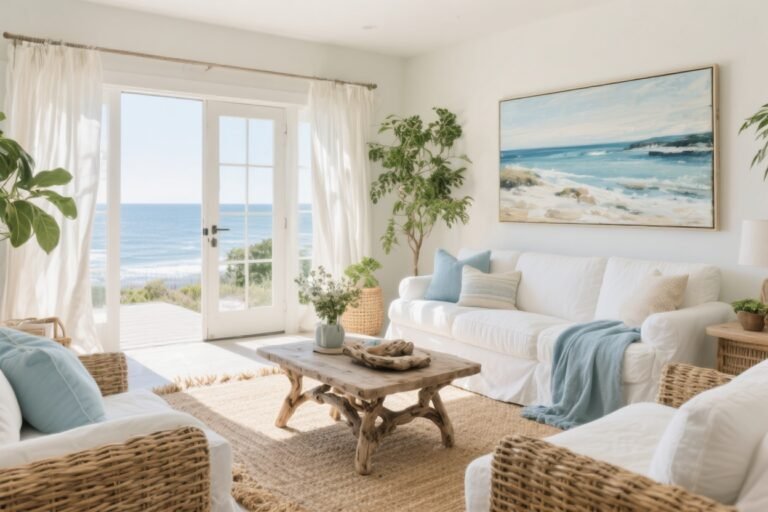
4. Coastal Minimalist With Woven Layers
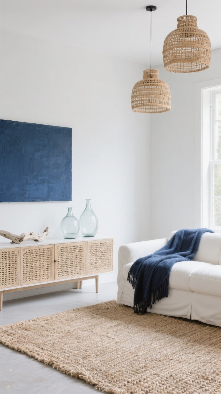
For the “I like spaces that breathe” crowd, this palette leans minimalist: lots of **white**, touches of **navy**, and generous **woven textures**. It’s serene, modern, and mercifully uncluttered.
Why It Works
Clean lines and a restrained palette keep things calm. Woven textures add soul so it doesn’t feel sterile.
- Walls: Soft white or pale greige (cool undertone to balance navy)
- Textiles: Seagrass or sisal rug, rattan pendants, cane-front storage
- Accents: A single oversized navy artwork or throw
- Decor: Clear glass vases, bleached driftwood, simple ceramics
Pro tip: Limit yourself to three accent pieces in navy—one textile, one art moment, one small decor item. Edit like you mean it, IMO.
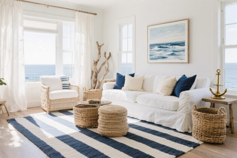
5. Breton Stripes & Boat Club Brights
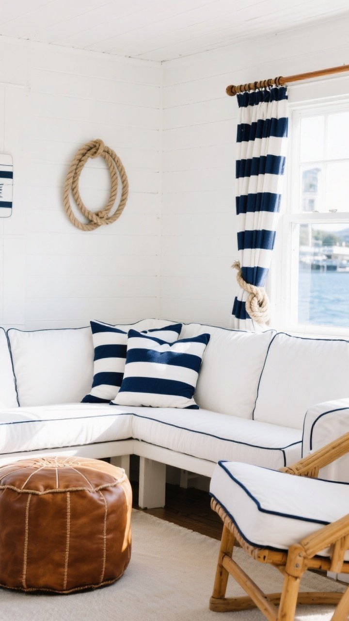
Playful but still chic, this palette riffs on classic **nautical stripes** with crisp **white**, bright **navy**, and warm **tan leather**. It feels preppy, upbeat, and a little nostalgic (in the best way).
Why It Works
Stripes bring movement and energy. Tan leather warms the cool navy/white combo and keeps it from feeling too “uniform.”
- Walls: Pure white or pale coastal blue as a backdrop
- Textiles: Navy-and-white stripe pillows, bench cushion, or shower curtain
- Furniture: White slipcovered sofa, tan leather ottoman or sling chairs
- Details: Navy piping on upholstery, striped trim on drapery, rope knots (sparingly!)
Pro tip: If you’re stripe-shy, start small—napkins, a runner, or a lumbar pillow. Stripes are the espresso shot your room wants.
6. Saltwashed Blues With Driftwood Neutrals
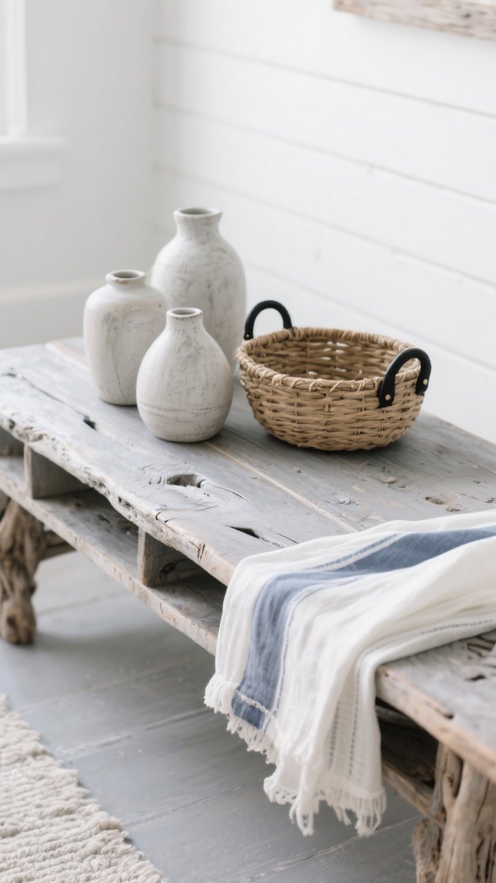
This one’s for the “I collect sea glass” types. Layer soft **navy**, chalky **whites**, and **driftwood** tones with a weathered, lived-in finish. It’s coastal without cliché—subtle, airy, gorgeous.
Why It Works
The palette mimics natural seaside textures and patina. Variations in tone keep it interesting, even if the colors are quiet.
- Walls: White with a whisper of gray
- Wood: Gray-washed oak, reclaimed pine, or bleached wood consoles
- Textiles: Stonewashed linen in off-white and soft navy, gauzy sheers
- Accents: Woven baskets, ceramic vases in chalky finishes, matte black hardware for contrast
Pro tip: Mix “perfect” with “imperfect.” A sleek white lamp next to a weathered wood tray? Chef’s kiss. The contrast makes both shine.
7. Modern Maritime With Matte Black
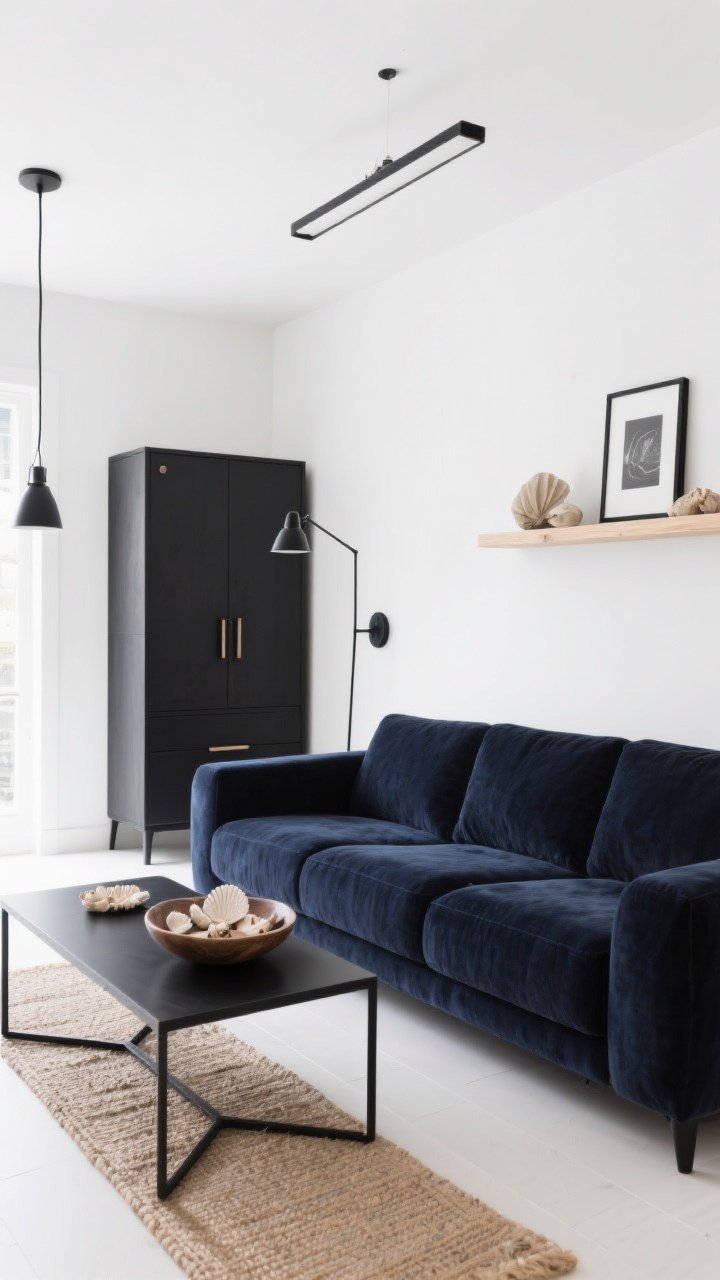
Want nautical, but make it edgy? Pair **navy** and **white** with **matte black** and restrained natural textures. It’s cool, contemporary, and so much chicer than anchor prints everywhere.
Why It Works
Black sharpens the navy/white combo and adds modern structure. The natural elements keep it from feeling cold.
- Walls: Clean white or soft white with cool undertones
- Anchors (not literal): Navy velvet or performance-linen sofa, black metal coffee table
- Lighting: Matte black sconces or a linear pendant
- Natural Touches: Jute runner, pale oak shelves, a bowl of shells (curated, not dumped)
Pro tip: Repeat black in at least three places—frames, lamp, cabinet pulls—so it feels intentional, not random. FYI, this palette loves crisp geometry and simple shapes.
How To Pull Any Palette Together
- Choose your dominant: Decide if your room is mostly white, mostly natural, or mostly navy. That’s your anchor.
- Stick to a 60-30-10: 60% base, 30% secondary, 10% accents. It’s basic color theory for the win.
- Repeat colors: Use each tone at least three times around the room for cohesion.
- Mind undertones: Pair cool whites with cool navies; warm whites with warmer woods.
- Balance shine: Mix matte (paint, linen) with shine (metal, glass) so the space feels layered.
Quick Shopping Checklist
- One standout navy piece (sofa, cabinet, headboard)
- White base textiles (curtains, bedding, slipcovers)
- Natural fiber rug (jute, sisal, seagrass)
- Mixed metals (chrome for classic, brass for warm, black for modern)
- Structured stripes or subtle coastal patterns
- A few organic accents (ceramics, driftwood, woven baskets)
Bottom line: Navy, white, and natural tones are the ultimate coastal combo—versatile, polished, and endlessly remixable. Pick your favorite palette above, layer in texture, and let the good vibes roll in like a calm tide. You’ve got this—now go make your space look like a vacation you never have to leave.