7 Coastal Color Combinations That Make Every Room Feel Like Vacation
Want your place to feel breezy, fresh, and just a little smug—like you live steps from the sand? Same. The magic trick is color. The right coastal palette instantly turns a regular room into a relaxed, sun-kissed escape without a single seashell in sight (unless you’re into that; no judgment).
Below are 7 coastal color combinations that nail the vibe—calm, clean, and a little chic. Each section breaks down the look, how to use it, and easy swaps so you can test-drive colors before committing. Ready to channel your inner beach house owner? Let’s go.
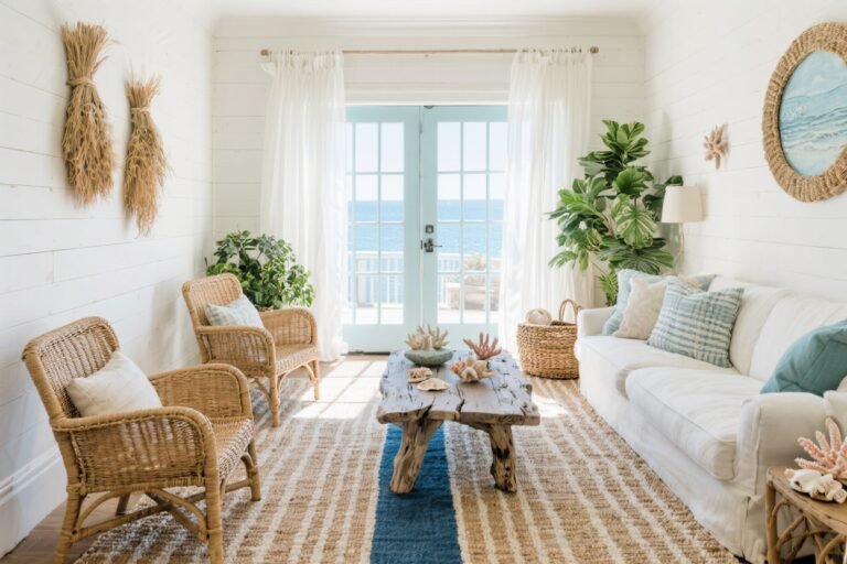
1. Salt Air Whites + Sea Glass Green
This combo is crisp and breathable, like throwing open the windows after a summer thunderstorm. Think soft white walls paired with muted sea glass green accents that glow in natural light. It’s gentle, not minty—more foggy shoreline than tropical smoothie.
Where It Shines
Entryways, bedrooms, and kitchens with good light. If your space leans dark, go warmer on the white (creamy, not stark) to keep it welcoming.
How To Use It
- Walls: Warm white (not hospital white) as your base.
- Accent: Sea glass green on a bathroom vanity, kitchen island, or a statement lamp.
- Textiles: Linen drapes, sage-leaning green pillows, and woven throws.
Style Tips
- Mix matte ceramics and clear glass—it feels airy and collected.
- Try a gallery of vintage nautical prints with pale green mats for subtle color repetition.
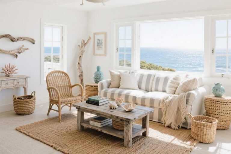
2. Sand Dune Beige + Driftwood Taupe
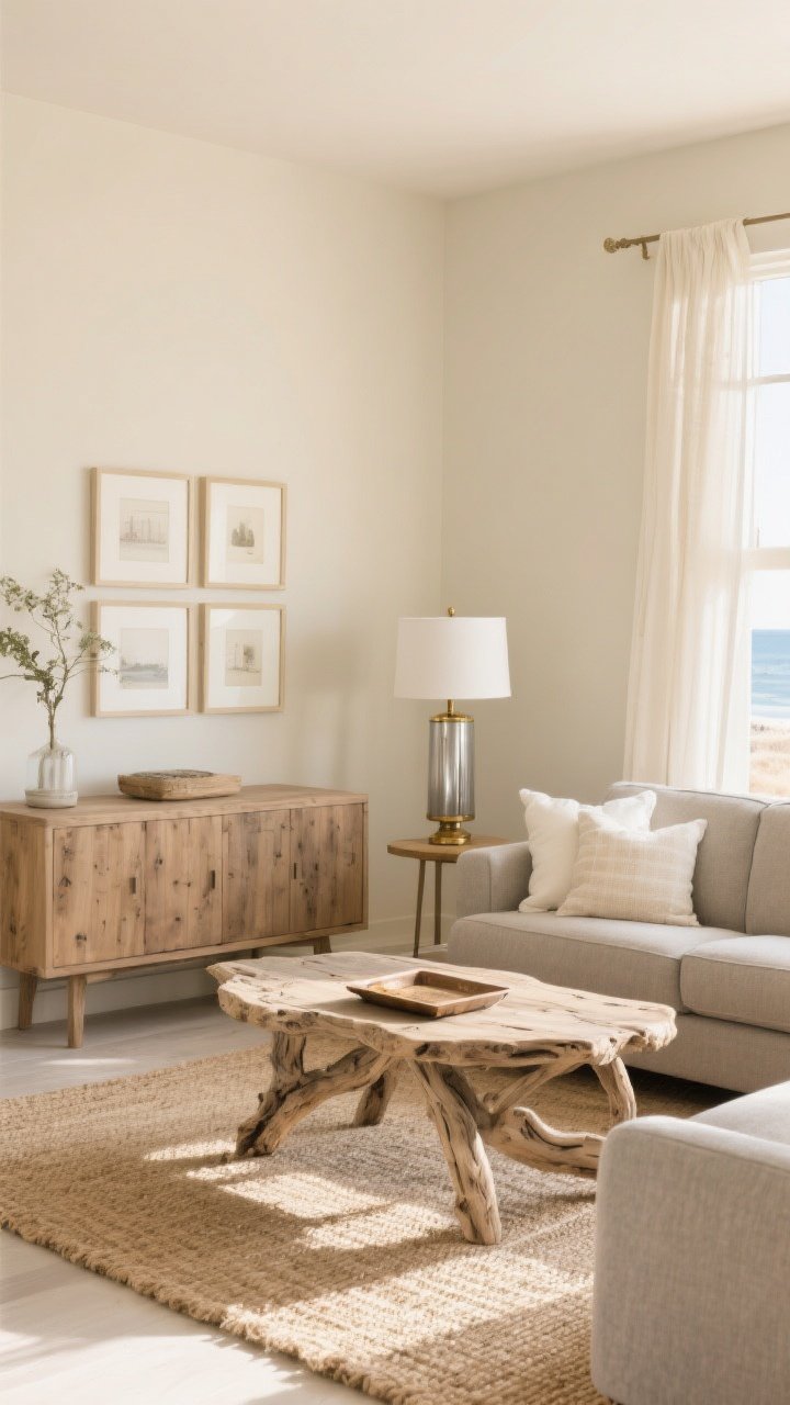
Neutral lovers, this is your low-drama, high-style moment. Beige and taupe sound basic, but layered right, they’re pure coastal sophistication—like a linen suit that actually fits.
Where It Shines
Living rooms and dining spaces that need warmth without heaviness. Also great for rentals or spaces you’ll tweak often.
How To Use It
- Walls: Pale sand beige—nothing yellow.
- Furniture: Driftwood-toned coffee table, oak sideboard, or gray-beige sofa.
- Rug: Natural jute or sisal for texture (and easy cleanup).
Style Tips
- Add brushed nickel or aged brass for quiet shine.
- Bring in soft white accents (lampshades, frames) so it stays beachy, not muddy.
3. Navy Deep + Crisp White
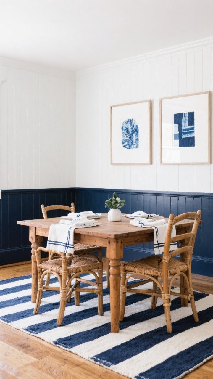
Classic coastal, zero apologies. Navy and white is sharp, timeless, and looks put-together even when the mail is stacked on the console (relatable).
Where It Shines
Entryways, powder rooms, and dining rooms. It’s bold but controlled, like a tailored blazer for your home.
How To Use It
- Walls: White walls with navy wainscoting, or a single navy accent wall.
- Textiles: Navy-striped pillows, white bedding with navy piping, or a nautical stripe rug.
- Art: Indigo-dyed prints or framed coastal photography.
Style Tips
- Break up the contrast with warm wood and rattan accents so it doesn’t go full yacht club (unless that’s the point, IMO).
- Use matte navy for a modern edge; gloss can read too formal.
4. Coral Blush + Cloud White
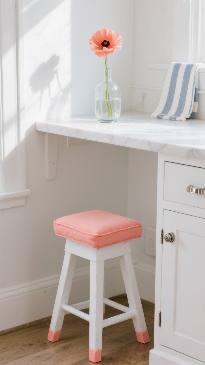
Coastal doesn’t have to be all blues. Coral blush brings a soft, sunlit glow—happy but not hot pink. Paired with cloud white, it’s fresh, modern, and ridiculously flattering in the late afternoon light.
Where It Shines
Guest rooms, breakfast nooks, and small bathrooms that need personality without clutter.
How To Use It
- Walls: Cloud white as a backdrop to let the coral breathe.
- Accent: Coral on a bench cushion, art matting, or painted stools.
- Florals: Peachy ranunculus or a single coral poppy in a clear vase—instant mood lift.
Style Tips
- Keep metals light and bright (polished nickel or white enamel) for a clean finish.
- Introduce soft blue-gray in micro doses (a throw, a stripe) to cool the palette.
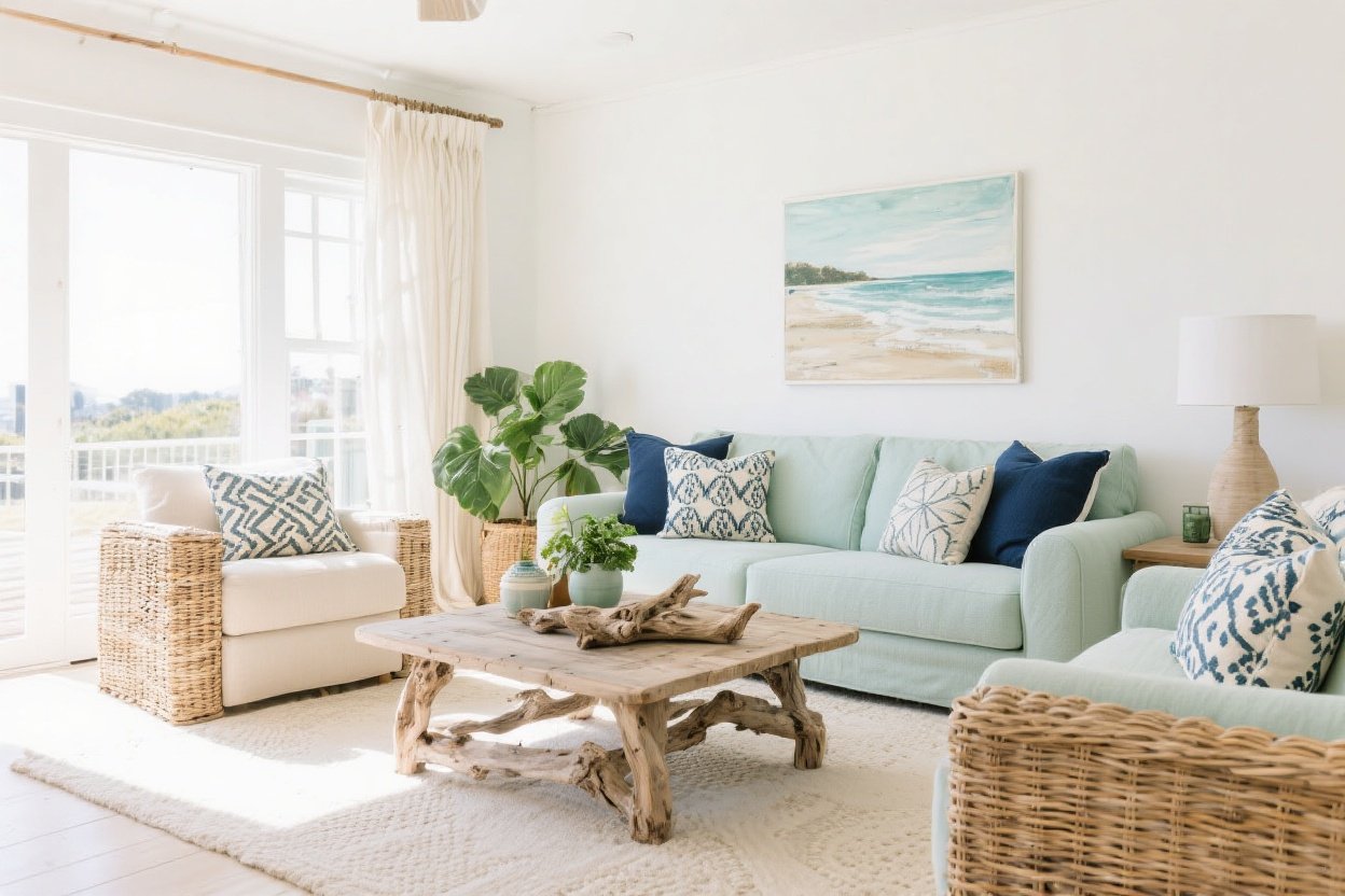
5. Misty Blue + Weathered Gray
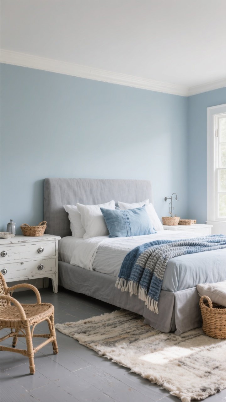
If your vibe is “quiet coastal morning,” this combo is your soulmate. Misty blue reads like sea fog; weathered gray steadies things so it doesn’t get too pastel or precious.
Where It Shines
Primary bedrooms, offices, and living rooms where you want calm without snoozing the entire day away.
How To Use It
- Walls: Misty blue with a hint of gray (avoid baby blue).
- Large Pieces: Gray slipcovered sofa, whitewashed console, or gray-toned flooring.
- Layers: Blue-and-gray woven throws, pale denim pillows, soft wool rugs.
Style Tips
- Balance cool tones with warm textures: wicker baskets, cane chairs, or a chunky knit.
- Choose antique zinc or aged silver hardware for consistency.
6. Turquoise Tide + Sun-Bleached Teak
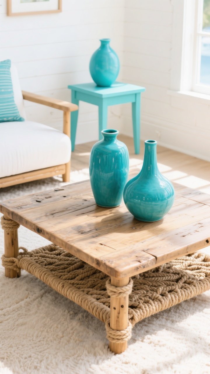
This is your playful coastal combo—vibrant but grounded. Turquoise brings the sparkle; sun-bleached teak adds earthy calm, like a boardwalk after a dip in the ocean.
Where It Shines
Porches, sunrooms, and kid-friendly spaces. Also perfect for rental refreshes that need a pop in photos, FYI.
How To Use It
- Walls: Keep them white or very pale linen to let turquoise sing.
- Furniture: Teak coffee table, teak dining chairs, or a reclaimed bench.
- Accents: Turquoise vases, outdoor cushions, or a painted side table.
Style Tips
- Repeat turquoise in three places (pillows, art, vase) so it looks intentional.
- Layer in rope or jute textures to keep the energy beachy, not boho-tropical mashup.
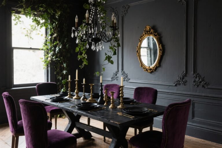
7. Indigo Tidepool + Warm Brass + Cream
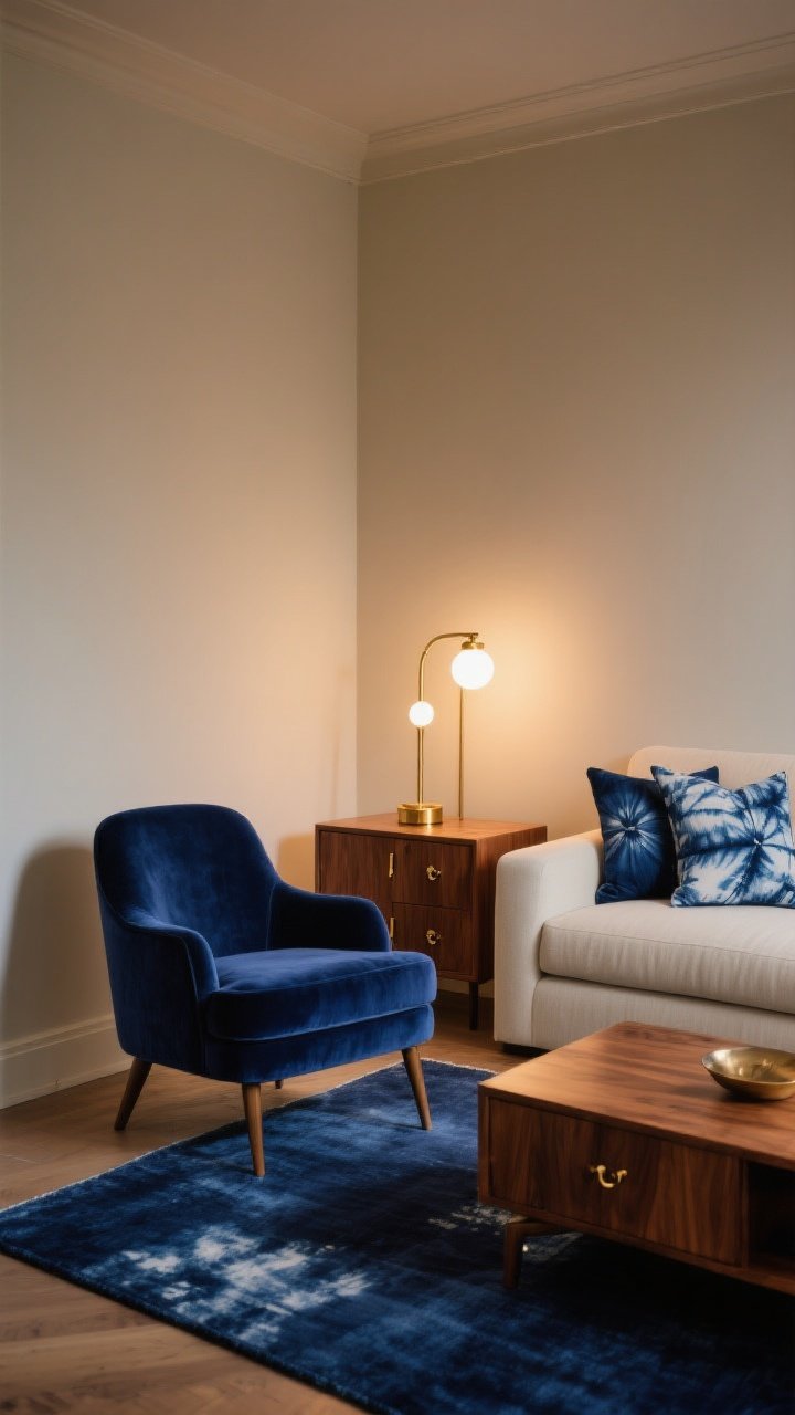
For a slightly moodier coastal look (hello, evening beach walks), go with indigo, warm brass, and buttery cream. It’s elevated but still relaxed—like a linen dress with gold hoops.
Where It Shines
Dining rooms, cozy living rooms, or any space that needs drama without going dark and gloomy.
How To Use It
- Walls: Cream or soft almond for a glowy base.
- Statement: Indigo velvet chair, dyed indigo shibori pillows, or a deep blue rug.
- Metal: Warm brass in lighting, cabinet pulls, or frame edges.
Style Tips
- Keep wood tones medium and warm (walnut, honey oak) to bridge the palette.
- Use warm white bulbs so brass glows and indigo stays luxe, not flat.
Quick Color-Choosing Cheatsheet
- Test swatches on multiple walls—light shifts everything. Morning vs. evening can be a plot twist.
- Sheen matters: Matte or eggshell for walls; satin for trim; semi-gloss for bath cabinetry.
- Anchor with neutrals: If your accent is bold (turquoise, coral), ground with wood, rattan, or stone.
- Repeat colors at least three times in a room for cohesion—art, textiles, accessories.
- Start small: Pillows and art first. Then commit to paint. Your future self will thank you.
Texture Pairings That Always Work
- Linen + Rattan: Instant coastal texture without trying too hard.
- Matte Ceramics + Clear Glass: Airy, modern, and renter-friendly.
- Driftwood + Soft Metals: Bring warmth and shine without stealing the show.
You don’t need a beach house to get the beach house vibe. Pick one of these coastal color combinations, start with a few accents, and let the palette build around you. Worst case? You repaint a stool and call it a day. Best case? Your home feels like vacation—minus the sand in your shoes. Win-win.